
Decorating Mistakes: Living and Dining Rooms
Decorating your home and achieving balanced proportions can be a challenging and exciting new project. However, for those of us without the means of hiring professional help, it's easy to fall prey to a number of common decorating mistakes. Consider the following points carefully before embarking upon any grand decorating plan.
Color schemes
Your chosen color scheme must be thoroughly thought out, from the paint on the walls to the floor, upholstery and any accessories. If you are starting from scratch, then you can be more adventurous with your choice of paint, as you will be buying your furnishings to match your chosen color. If you already have a variety of pieces, as most of us do, such as a sofa or upholstered chairs then your wall paint color will need to work around these pieces. Be careful with the paint color you choose, it may look stunning in a magazine or on the side of the paint can, but in reality paint color and tone can differ considerably depending on the natural light, the size of the room and its furnishings. The tone may also vary at different times of the day as natural lighting changes. The color should be based on your reality, not on what looks good in the latest home decorating magazine. We recommend trying your paint out on the wall before you start, to give you an idea.
Unflattering lighting
The use of lighting is a powerful mood enhancer, and an important element in our homes. It has the ability to make a room look larger or smaller, inviting or uninviting. Many of us however, do not utilize lighting properly. A frequent mistake is to rely on one central hanging light in any living or dining room. This is not only unflattering, but also non adjustable. A better solution is a balanced lighting plan with dimmers. There are times of day when we need bright lighting and other times of day when dim soft lighting is appropriate such as during dinner parties, where dazzling lighting is not relaxing.
Uncomfortable and impractical furniture
It doesn't matter how beautiful any piece of furniture is, if it's uncomfortable to sit on, it's not worth having. A good example of this is buying beautiful slender dining room chairs that are not comfortable to sit in. This discomfort will ruin the whole dining experience, family and guests alike will not want to remain seated at the dining room table if the experience is uncomfortable. This rule applies to any piece of furniture: if it looks great but is impractical (i.e. you can't sit or relax on it) it's no good. Having all your sofas and upholstered chairs in a flawless white is another example of impracticality. Although white furnishings can look stunning, they only remain stunning as long as they're clean. Keeping them clean and using them at the same time can be tricky, especially if you have a family. This can lead to the furniture creating a constant worry and a tense, rather than relaxing environment. The same can be said when buying pieces of furniture that are the current trend. They may be at the height of fashion, but if they don't match your existing furnishings, they won't look good. Everything you buy or plan on buying must be planned and mapped out before hand.
Furniture that doesn't fit the space
Furnishings must create a balance. The size and form of the space must be carefully considered when purchasing new furnishings. Traffic needs to be able to move freely around the room. Stuffing a small room with over-sized pieces will undoubtedly make it look smaller. There is also an element of practicality involved. Will larger pieces even fit through the door? Take into account the height of any piece of furniture, as this can also make a big difference to the overall feel of the room. Buying chunky dining chairs for a tight dining area is another definite no. The space will feel cramped and awkward, regardless of how attractive the chairs actually are. If you are not buying a matching set of dining chairs together with a table, then make sure you measure the height of the dining room table in relation to the chairs. Otherwise you may very well end up with chairs that are either too low or too high. There are multiple styles of dining chairs to choose from on the market these days, with bespoke chair making services becoming increasingly popular. Finding something to suit and fit your space should not be an issue.
Too many patterns
Your home does not need to be completely matching, but having everything in exactly the same tone and texture can look extremely dull and uninteresting. It is good to mix and match your styles and colors. Although, having said that, it is also possible to accidentally go overboard and have too many colors and contrasts. This can make a room look messy and confusing as the eye doesn't know where to focus. Likewise with art, not every free space of wall needs to be covered with art work.
Proportionate accessories

A tiny rug next to a large dining room table or large sofa will look out of proportion. A larger rug with all major pieces of furniture touching its edges will create a more balanced appearance. A giant lamp in a smaller room with more delicate furnishings is another example of disproportion. If your sofa has so many throw cushions on it that you can't actually sit down, it is overkill. Balance is the key.
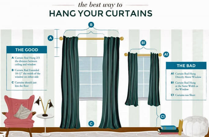
Hanging curtains too low
From Style by Emily Henderson
Hanging your curtains only a couple of centimeters away from the top of your window can actually make it look smaller. We always encourage hanging curtains high and wide: this visually enlarges the window and adds height to the room creating an impression of more vertical space by leading the eye upwards. It also gives the whole room a more airy, spacious feel. Floor length curtains, hung high and wide in a similar color tone to the wall paint can create a seamless look, an excellent way of creating space as well as leading the eye right out of the window. Hanging curtains right above the window will have the opposite effect and can make the window looked crowded and the room look smaller. This gallery from Elle Decor has fantastic examples of this.
Hanging art and frames too high
If you have to strain your neck to look up at your artwork, it is too high. This is a common mistake, for whatever reason, most people tend to hang works of art and frames on the high side. Admiring a work of art that is hung too high up can be tiring, it is recommended that any images or works of art should be hung at 57" on center. This means the center, or the middle of the artwork should be at eye level, (the hook will of course be higher). Interestingly the 57"center guidelines are adopted by many galleries and museums as standard practice, it is calculated on the average human eye height and creates a more pleasing viewing experience. The same standard should be used throughout your home.
Excessive ornaments/portraits
Ornaments and portraits can really give a room character as well as creating your own personal mark on the space. Too many ornaments or portraits however, will look cluttered, cramped and disorganized. If you are a fan of photos and can't bear getting rid of your collection of photos of family and friends, then consider a unified wall display rather than a shelf full of individual frames. The same can be said for ornaments, more is not merrier. Too many trinkets can look like clutter.
Flora/fauna

That beautiful plant or fern that looked fantastic in your friend's house and in this month's edition of home decorating ideas, has not flourished in your living room. To the contrary, it looks unhealthy and almost dead! Flora and fauna all require different environments in order to thrive. Do your research carefully. Look at what the natural light is like in your chosen room, the space and dimensions of the plant's final location, and overall environmental conditions in the room. Only after you've researched all the conditions, will you be able to choose a plant to match the characteristics of the room. Here is a helpful list of how different house plants react to light.
Lack of continuity
The living spaces in any home should have a natural flow of movement between them. They do not necessarily have to be exactly the same style, but there must be a feeling of continuity between them. Wall paint color should not differ drastically between the kitchen and the dining room for example, a bold and bright color in one room and muted pastel tones in the other. The same can be said of the flooring, different colors and patterns chop up the space. Similar or ideally, the same flooring throughout most of the living area will open the space and allow the eye to follow through.
If you are thinking of decorating your living room or dining room then we strongly recommend working from a well thought out plan, that takes into consideration the points above, it also takes the pressure off as decorating can seem like an overwhelming task. By working from a plan, you can work on one thing at a time, this way common decorating mistakes can be altogether avoided rather than corrected at a later date after you have finished.
By: Luis Leonzo